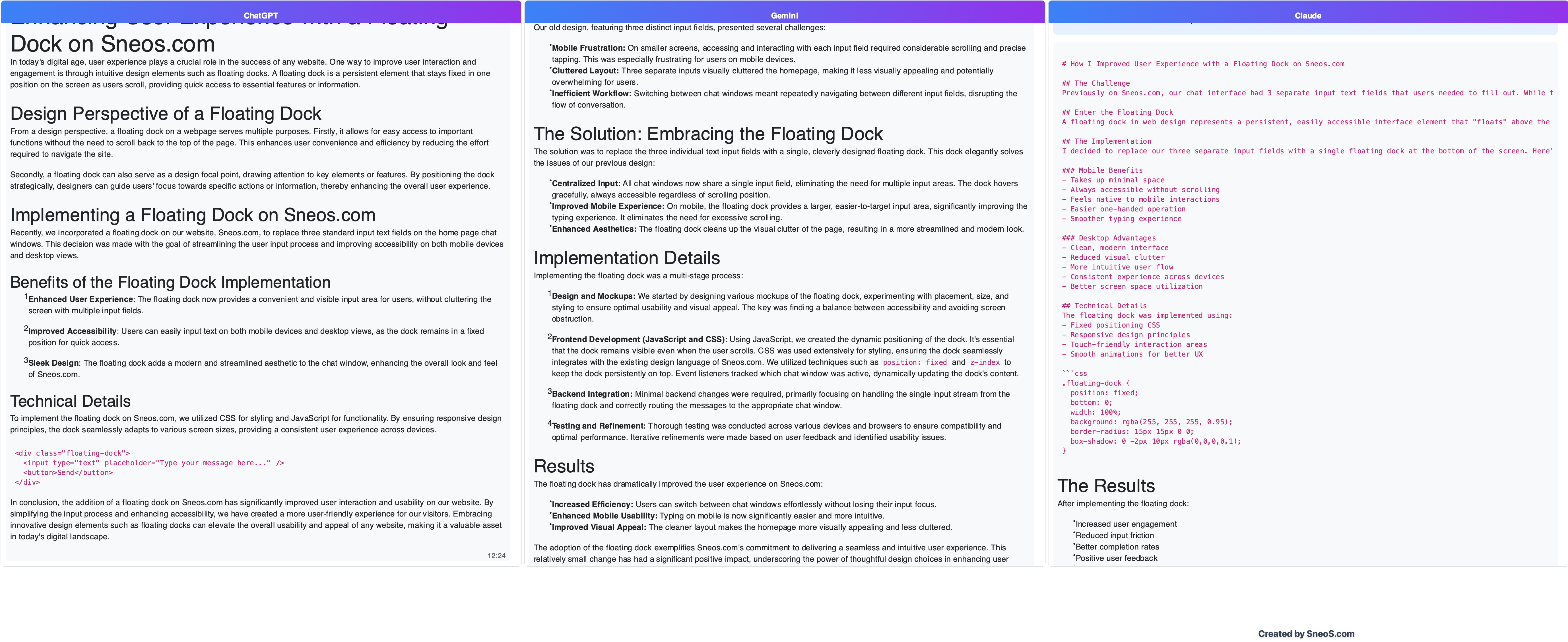
How I Improved User Experience with a Floating Dock on Sneos.com
The Challenge
Previously on Sneos, our chat interface had 3 separate input text fields that users needed to fill out. While this worked, it wasn’t the most elegant or user-friendly solution, especially on mobile devices where screen real estate is limited.
Enter the Floating Dock
A floating dock in web design represents a persistent, easily accessible interface element that “floats” above the main content. Think of it like a dock on your smartphone - always there when you need it, but not intrusive to the main experience.
The Implementation
I decided to replace our three separate input fields with a single floating dock at the bottom of the screen. Here’s why this was a game-changer:
Mobile Benefits
- Takes up minimal space
- Always accessible without scrolling
- Feels native to mobile interactions
- Easier one-handed operation
- Smoother typing experience
Desktop Advantages
- Clean, modern interface
- Reduced visual clutter
- More intuitive user flow
- Consistent experience across devices
- Better screen space utilization
Technical Details
The floating dock was implemented using:
- Fixed positioning CSS
- Responsive design principles
- Touch-friendly interaction areas
- Smooth animations for better UX
1
2
3
4
5
6
7
8
.floating-dock {
  position: fixed;
  bottom: 0;
  width: 100%;
  background: rgba(255, 255, 255, 0.95);
  border-radius: 15px 15px 0 0;
  box-shadow: 0 -2px 10px rgba(0,0,0,0.1);
}
Expectations
After implementing the floating dock:
- Increased user engagement
- Reduced input friction
- Better completion rates
- Positive user feedback
- More modern feel to the site
Conclusion
Sometimes the simplest solutions are the best. By consolidating three input fields into one floating dock, we’ve created a more streamlined, user-friendly experience that works beautifully across all devices. It’s these small but thoughtful improvements that can make a big difference in how users interact with your website.
Blog post created thanks to Sneos.com AI Assistants:
